
Instacart revamp case study
I collaborated with a team of designers comprising of Khalia Gilliam, Levi M De Freitas, Mohsen Alattar, and myself to overhaul the Instacart app. Together, we conducted a comprehensive series of tests to understand user preferences and pain points associated with the application. Through this process, we gained valuable insights into the principles of accessible design and user-centric development. Crucially, we recognized the importance of prioritizing user feedback over personal preferences, emphasizing the significance of creating an app that resonates with its users.
We meticulously crafted a set of non-leading survey questions to extract insightful data from respondents. After refining our questions through multiple iterations, we deployed the survey on various social media platforms, gathering 40 responses and substantial additional feedback from individuals eager to engage with us further. Moreover, we incorporated a final question in the survey, allowing respondents to volunteer their emails for continued interviews.
Teammates- Mohsen Alattar, Khalia Gilliam, Levi De Freitas
Instructor- Sara Hall
Survey
Our survey results revealed discrepancies between respondents' preferences and actual behaviors. Specifically, we identified instances where users liked certain features of Instacart while simultaneously indicating disinterest in them. This disparity underscored the importance of thorough user research and highlighted the need to interpret feedback thoughtfully to inform our design decisions effectively.
When going on Instacart, which of these categories are you familiar with?

What are your Primary uses for Instacart?

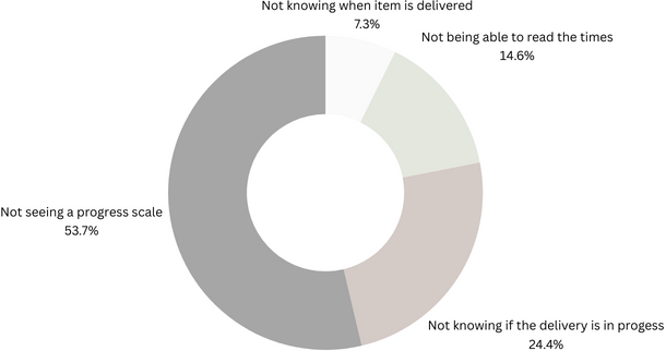
When going on Instacart, some things may seem confusing about the delivery display.

Interviews
During the interview phase, each team member was tasked with interviewing two individuals from our survey respondents. In my interviews, I had enlightening conversations with two users: Shakira and Derek. Their insights proved invaluable in informing us of our redesign efforts for Instacart. These discussions revealed that both Shakira and Derek primarily utilize web browsers instead of the mobile app. They highlighted various inconsistencies between the app and the website, noting that the website offers a more straightforward and less cluttered experience, which they prefer. Derek specifically highlighted issues with the accessibility tools within the app, emphasizing the importance of addressing these shortcomings to ensure a seamless mobile experience for all users. These firsthand accounts provided crucial guidance as we refined the Instacart platform. The other interviews continued with difficulty navigating the app and the discounts needing to be fixed. From this, we created different categories and separated them into 1-4 based on what we thought was the most important thing to fix.
Four Major issues
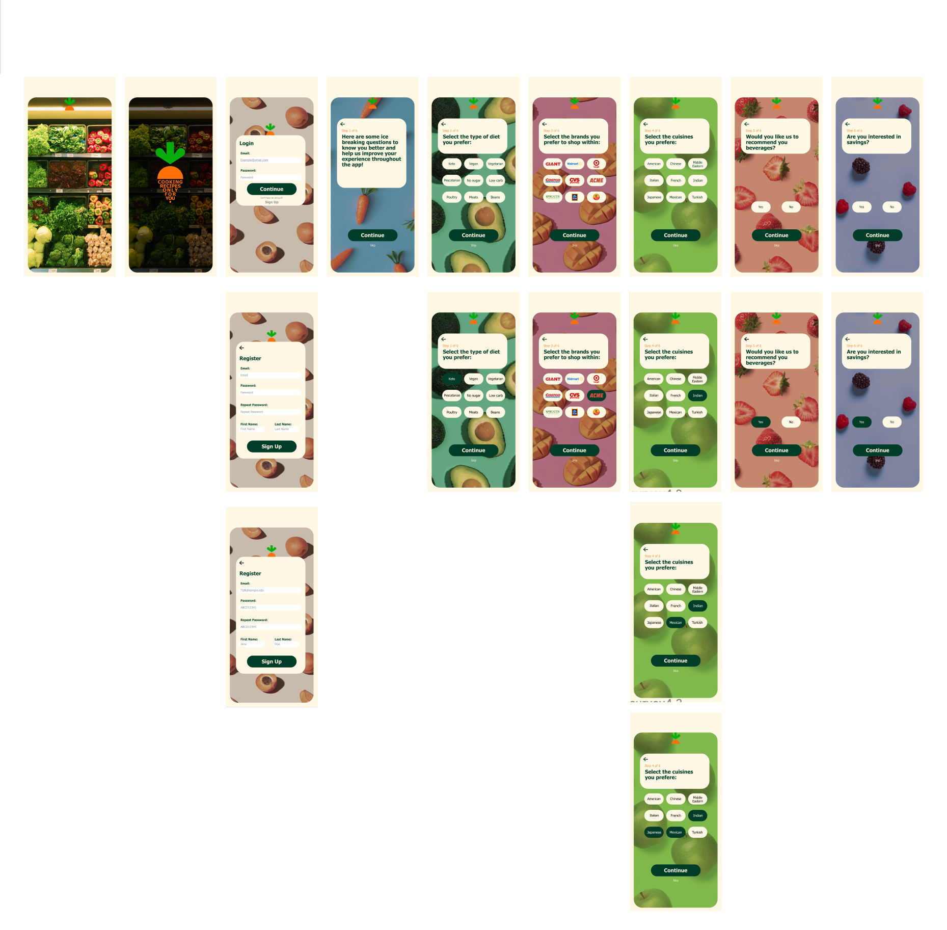
After the interviews, we identified four sections that needed to be improved. Mohsen did onboarding. I did the homepages and organization. Khalia did check-out and remove-all options. Last but not least, Levi had discounts and budgeting.
-
Creating an onboarding process aims to create a series of questions to organize what will be depicted on the main page. From our Research, we found that customers were shown too many options on the homepage that didn't connect with what they were looking for when shopping on Instacart.
-
Create a homepage that is less congested and easier on the eyes. Organize the sections to create easy navigation. We found that giving the customer more options caused them to become overwhelmed. The interviews found that most people wanted less congestion on the homepage and less overwhelming options. We worked to make more visual breathing room throughout the new layout of the homepage
-
We created options for alternative priced items in the checkout section and a remove all items button. The customers we talked to who want to save money also spoke about how you typically need help seeing sales in the store. We worked to create a budget section that would scan through to look for price alternatives in different stores to find what store is fit for what you have in your cart. This gives the feeling of being able to look at ads for various grocery stores before you go in. It also visually depicts if you were staying within your budget.
-
This budget section is intended to complement the check-out budget section. It will be in the grocery store and tell you about price alternatives for the same item. For example, it would show you the store brand versus the name-brand prices and what would fit your budget better.
Khalid

mohsen

Autumn
levi

In my role, I focused on redesigning the homepage of the Instacart app and establishing a clear hierarchy of information. One significant addition I introduced based on insights from individual interviews with Derek and Shakira was a location check feature directly on the homepage. Understanding their experiences of packages being delivered to the wrong address, I incorporated a section beneath the cart displaying the selected delivery location. Users can easily confirm the address or click to edit it, providing a constant reminder of where their groceries will be shipped.
Additionally, I streamlined the homepage by leveraging motion filters implemented during the onboarding process. This allowed for a reduction in clutter, providing users with a cleaner and more intuitive interface. By incorporating these changes, we aim to enhance user experience and minimize the likelihood of delivery errors.
Mohsen’s section, he utilized Attractive pictures to intrigue the viewers to continue with the mini survey in the beginning. He created an interactive icons that go with the Instacart logo. Khalia’s section. Shows the cart option as well as the discount ad in to switch out for name brand items to stay in your budget. Levi's section is the budget shopper option which shows price variation through all different stores. She was inspired of the swiping options, in other apps, like bumble or Tinder, and wanted to create the same options for Instacart groceries. We work together to create a carousel effect in Figma to create the illusion of swiping through items.