
Making Chestnut Hills website accessible
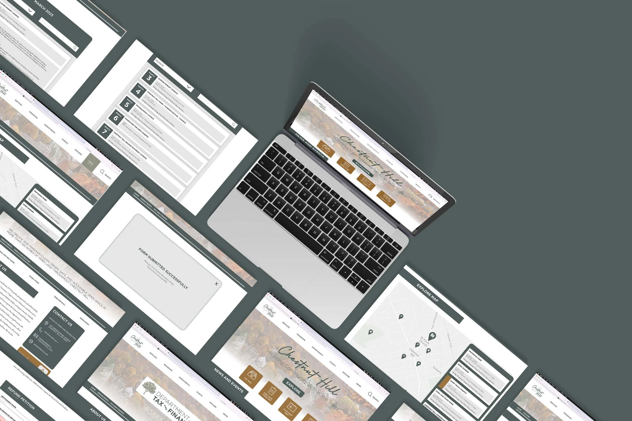
The objective of designing the Chestnut Hills neighborhood page was to create a webpage catering to the community members and their needs. The goal was to develop a digital product that people could easily navigate and easily access utilizing the most useful options. My groupmate Joe Casavecchia and I extracted specific traits from our research and built personas which helped us base our work on our target user.
Team Member - Joe Casavecchia
Instructor - Sara Hall
History
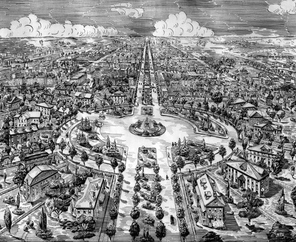
Chestnut Hill’s interesting history and beautiful chestnut trees were part of the reason we chose this neighborhood of Philadelphia. Founded by Francis Daniels, it was originally used for farmland and later became well known as an escape from the Center City heat. Chestnut Hill became part of Philadelphia in 1854 when the Chestnut Hill Rail Road opened, connecting everyone to Center City.
Demographics
Through our research we discovered that Chestnut Hill is primarily inhabited by well-educated middle-aged individuals. The median annual income is $106,000, and there is a mix of people with bachelor’s or master’s degrees or some college education level. Additionally, we observed a thriving community of small businesses and entrepreneurs along the Chestnut Hill tourist strip. Given that the area also participates in Restaurant Week in Center City Philadelphia, we aimed to target entrepreneurs and visitors attracted to the local attractions.


Ethnicities
Personas

Our research identified three distinct categories of individuals residing in Chestnut Hill. The first category is exemplified by Colleen Johnson, who represents the community of business owners in the area. Colleen is a dedicated mother who prioritizes her children's education, supports local small businesses, values qualifications, and advocates for a strong police presence to address theft concerns. She also expresses apprehension regarding affordable housing prices or rent due to the location of her company.
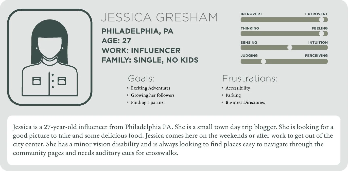
Jessica Greshan embodies the demographic of tourists visiting Chestnut Hill. At 27 years old, she is an influencer seeking a break from the hustle and bustle of Center City for a leisurely summer day. With vision disabilities, Jessica prioritizes accessible parking and walkways within the Chestnut Hill area. She desires easy access to comprehensive descriptions of tourist attractions that cater to accessibility needs.
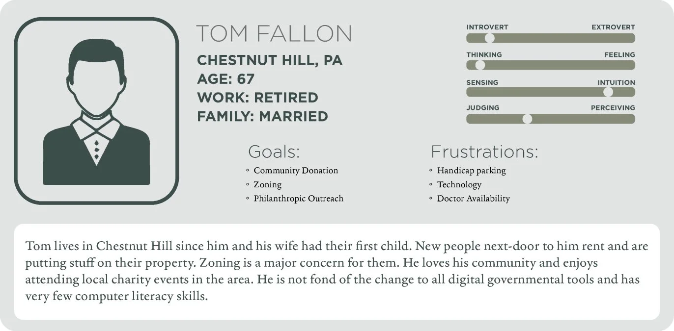
Tom Fallon epitomizes the older demographic within Chestnut Hill. Having resided in the area with his wife for over three decades, Tom often encounters frustration while searching for handicapped-accessible parking and navigating the technology featured on the current Chestnut Hill website. He becomes easily annoyed with his neighbors and seeks accessible information on zoning options and community outreach initiatives. Tom prefers a straightforward website layout with quick links to easily find the information he needs, as he is not inclined towards technology.
Logo’s


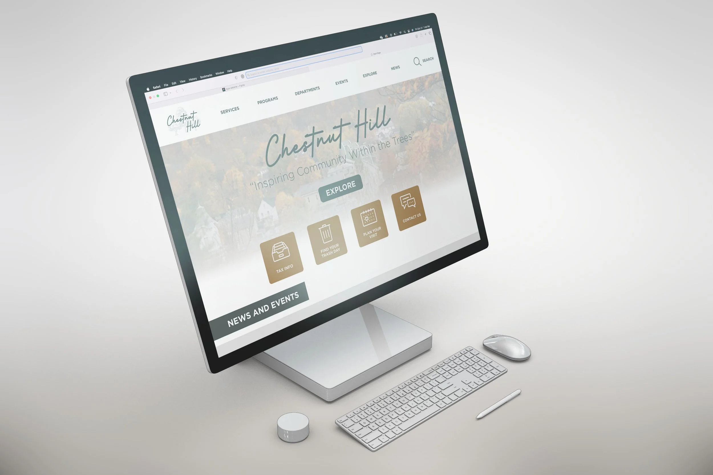
After brainstorming together, we came up with the idea of creating a modern and classy logo, just like the people who live in Chestnut Hill. Our primary logo is a script over top of Chestnut trees. Our second logo is a flat Chestnut Hill script used on the homepage. Lastly, we used the C H inside of a tree logo as our footer link to return to the homepage.
Colors and Type hierarchy

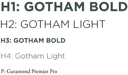
When picking the colors for the website, we decided to go with earth tones in green, gray, and orange to represent fall colors and to have a visual difference from the primary green color. For the typefaces, we picked a San Serif with multiple bold variations, with the body paragraph being a Serif to show a differentiation between the headings and body text.
UI Kit

Icons
Explore

Departments
Zoning

Education
Resources

Tree Species Identifier


Parks and Recreation

Finances


Careers

Sustainability

Alerts


Health

Transportation

Education
Accessibility testing
Lighter Text
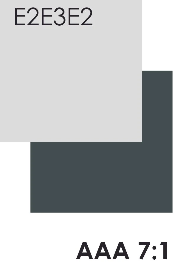
WCAG testing for light-colored text with a dark background. We did not want to use a basic white, so we used a light gray as our white on the Chestnut Hill website.
Darker Text
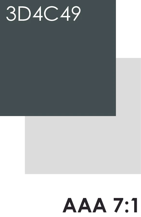
WCAG testing for dark text and light background. Instead of black, we used dark green to represent black.

Color passing
WCAG, or the Web Content Accessibility Guidelines, Regulates colors and typefaces to create an accessibility standard amongst websites. We put our colors through a checker on their website, and the color is past the base level and up to the more prestigious AAA level.

Button
The Trash button is an example of one of our accessible buttons. We made them more prominent in scale and will change color when selected.

Color combination one
Our most used combination is a light background with dark text, which makes reading more accessible for people with eye fatigue.
Color combination two
Another combination used for headers, or informational text, is to grab viewers' attention more than from combination one.

Navigation bar
The navigation bar was built to be accessible for people with tremors or unsteady hands. The selection section is larger than the standard navigation buttons. We also have a hover to visually show where your mouse is on the buttons.


Notification
When making the form, it was essential to have a text preview, as shown in the example of the fax number above. This gives users a visual example of what they are looking for when filling out a form. Adding information outside the text box instead of having the label inside of the box, makes it so users have continuous access to what they need to fill in. Also, it was essential to show what section has an error when information is incorrect, as seen in the bottom fax number (example in red). It is also standard WCAG Practice to have several versions of notifications for different disabilities. In this example, we used a caution symbol at the very end of the text box and a color change to read with small text that says ten numbers required as our third notification style.
Walk though
Conclusion
Chestnut Hills website was an excellent opportunity to learn how to work with others to create a beautifully accessible website. It was my first chance to go into deep detail on research regarding user experience and what would make the people of Chestnut Hill's website have an easier user experience.